MatBreakpoint
API that enables the use of breakpoints in a wide variety of contexts.
For optimal user experience, material design interfaces need to be able to adapt their layout at various breakpoints. MatBlazor uses a simplified implementation of the original specification.
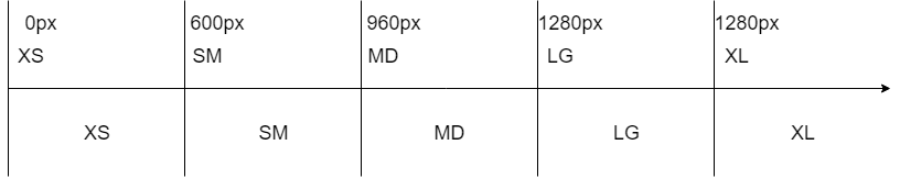
Each breakpoint (a key) matches with a fixed screen width (a value):
| Breakpoint | Size | Description |
|---|---|---|
| XS | 0px | extra-small |
| SM | 600px | small |
| MD | 960px | medium |
| LG | 1280px | large |
| XL | 1920 | extra-large |
These breakpoint values are used to determine breakpoint ranges. A range starts from the breakpoint value inclusive, to the next breakpoint value exclusive:
If you like MatBlazor, please put a star on GitHub.